


Real Outfits: Using contrast as a Bright Winter
Colour analysis at work in real life.

I’m on vacation, so I am simplifying my Substack articles. So, enjoy this free post, written with one hand on the keyboard and a croissant in the other (very sticky and messy, wouldn’t recommend it), to give you a bit of light but useful reading, in summer relaxation mode.
Real outfits for real lives:
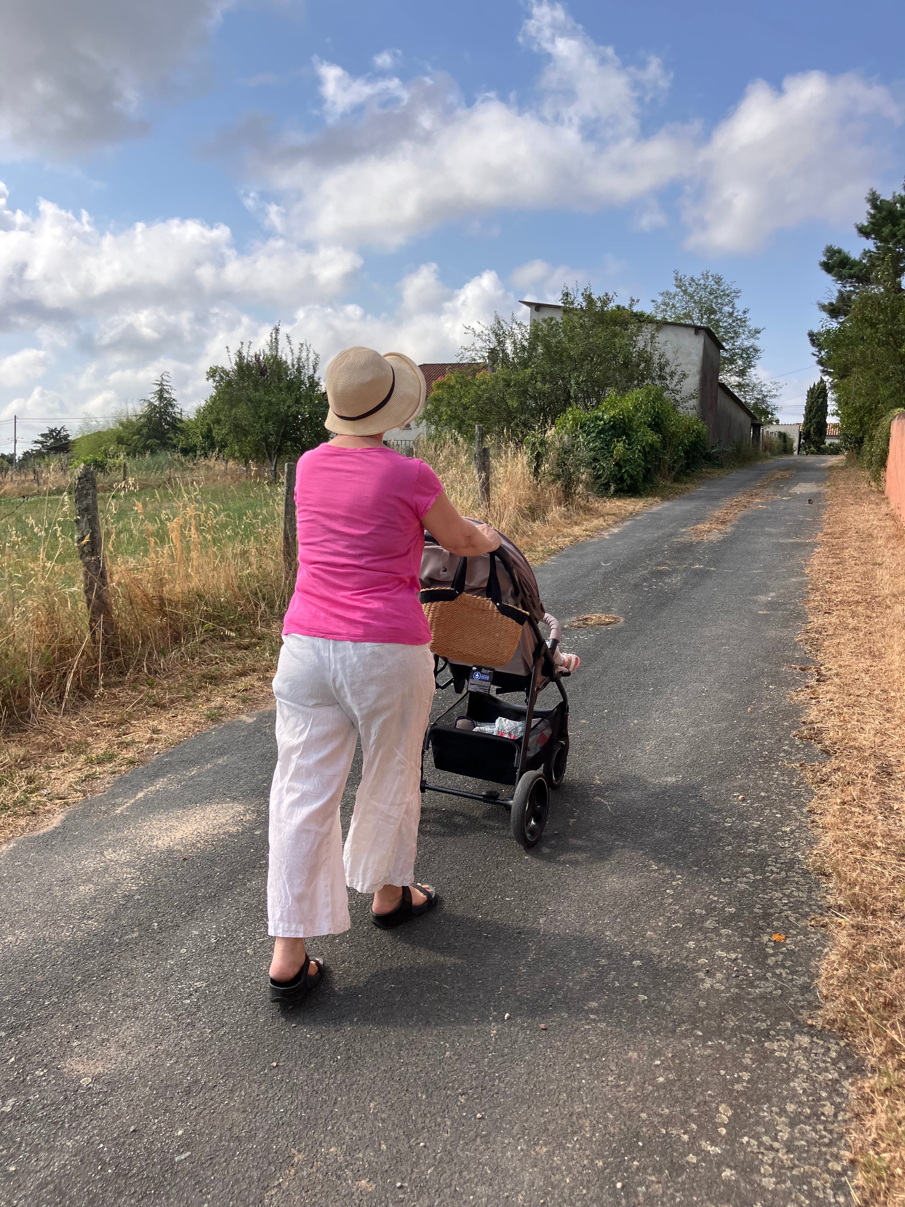
Allow me to show you a real-life example of using contrast if you’re a Winter.
I wrote about how to use contrast as a way to tweak an outfit into your Season in this post:
Acing the use of contrast when putting together an outfit - part 2 of 2

Welcome to Wardrobe Wednesday, colour analysis based nuggets of wisdom to make you a suave Scandinavian oozing of understated casual elegance.
And I’d like to show you how it looks in real life, as a Bright Winter.
I’m on vacation. It’s hot. Really hot, like it can be in France in July.
I’m on my way to the local bakery to buy bread for breakfast.
Real Outfit: White linen pants, old pink T-shirt (not quite as bright as it used to be, because, you know, laundry).
Accessories: comfy sandals, straw sun hat, straw handbag, small grandchild.
I would love to see how you use your contrast level, in real outfits.
As. Soft Autumn, I have been practicing with value contrast. I chose soft sage colour top, and tried it with two different pants: khaki olive and almond coloured.
I then took full body photos and noticed that lighter coloured pants created less contrast, which looked a lot better on me, or I should say that I looked a lot better in softer contrast.
I will keep playing, taking photos, and learning 🌸 Have a beautiful holiday in France!
I love the real world example. While I hope not to have one of those accessories for a while yet, I will take your example to heart...and find my summer hat.